Schedule Design
Redesigning the Schedule Page Considering the User Research and Needs in the Learning Platform
— ROLE
UI/UX Designer— CLIENT
EDU Medical School— PRODUCT
Learning PlatformContext
EDU is Europe’s first digital medical school. EDU’s vision is to increase the quality and accessibility of medical education via its innovative approach of blended learning which combines studying at the digital campus with clinical rotation in hospitals.
Problem
The schedule plays a crucial role in students' daily academic planning, allowing them to organize their studies efficiently. However, the existing scheduling system was unintuitive, requiring multiple clicks to access lesson details.
Through student interviews and collaboration with the Product Manager, the key issues were identified, leading to a redesign focused on improving usability and reducing complexity.
Challenges
Students found the current schedule complicated and time-consuming. They had to select the module, week, day, and lesson step by step, which made navigation slow and frustrating.
The main challenges included:
Too many clicks to access lesson details.
No easy way to see the entire module at once.
Difficulty navigating between weeks.
Goals
The goal was to create a more intuitive schedule that allows students to:
See the entire module at a glance.
Easily switch between weeks.
Access lesson details with fewer clicks.
Schedule old versionResearch
To understand the students' needs, I conducted research through various methods. I interviewed students to gather insights into their pain points and expectations. I also analyzed competitor platforms to learn from industry best practices. Additionally, I created user journey maps to identify problem areas and opportunities for improvement.
Information Architecture Redesign
We restructured the schedule to simplify navigation and reduce unnecessary steps. The new design allows students to access their schedule more quickly.
Key improvements included:
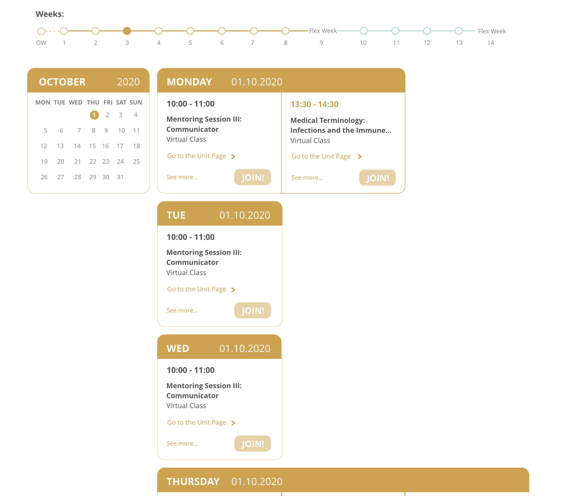
Displaying the module and week on the same screen.
Introducing a weekly overview with all lessons shown together.
Providing instant access to lesson details on a single page.
Wireframing
I created high-fidelity wireframes to visualize the new structure and test usability.
I started creating different alternatives to evaluate with the team and see which one would work the best.
The focus was on simplifying the weekly view, improving navigation, and reducing the number of clicks required.
UI Design
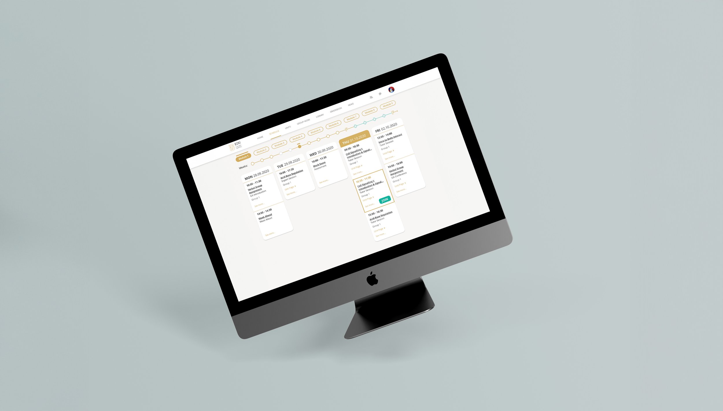
The final UI design followed EDU’s brand guidelines while focusing on simplicity and clarity. I used a clean layout, clear typography, and well-structured spacing to ensure an organized display.
The design highlights:
A structured weekly view with essential details.
Easy-to-read fonts and intuitive colors.
Clear call-to-action buttons for quick navigation.
Navigation Design Usability Testing & Improvements
I conducted usability testing with students to evaluate the new design's effectiveness. Based on their feedback, I made several improvements, such as adjusting font sizes, enhancing mobile responsiveness, emphasising class names.
Schedule Final VersionPrototype
〰️
Prototype 〰️
Test the Schedule prototype below!Prototype
〰️
Prototype 〰️
Outcome
The redesigned schedule significantly improved the student experience.
It reduced the number of clicks needed to access lesson details by 70%.
Students found it easier to plan their studies and reported higher satisfaction with the new design.


